Data visualization in Cortex Code Desktop
Cortex Code Desktop can render charts and KPI cards directly in the chat conversation while you analyze data. After the agent runs SQL or returns tabular results, it can turn key findings into inline visualizations so you can spot trends, compare categories, and read summary metrics without leaving the thread or exporting to another tool.
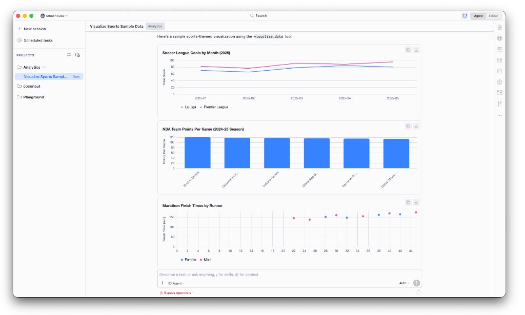
The agent uses an internal capability called visualize_data to draw each chart or metric card
in place. Visualizations follow your editor theme (light or dark).
Note
Inline data visualization is available in Cortex Code Desktop only. It is not available in Cortex Code CLI or Cortex Code in Snowsight. In those surfaces, ask the agent for tabular summaries or use your preferred BI or notebook tooling for charts.
How you get visualizations
Automatic charts after tabular results
When the agent presents tabular data with enough rows to support a meaningful chart (typically three or more), it may proactively add one to three inline visualizations that highlight the most important insights in that answer — for example, a trend over time, a top-N comparison, or a small set of KPI tiles.
Ask in natural language
You can request a specific chart at any time in the same conversation, for example:
- Plot revenue by month as a line chart.
- Show the top 10 regions by sales as a bar chart.
- Summarize these results as KPI cards.
- What share of orders is each status? Use a pie chart.
Visualize Data control
When a response includes SQL result tables or markdown tables, a Visualize Data control may appear near the chat input so you can ask the agent to chart that data in one step. The agent then chooses appropriate chart types and renders them inline below the relevant message.
Supported visualizations
| Visualization | Use when | Notes |
|---|---|---|
| Line chart | Trends over time or ordered categories | Supports multiple series for comparison. Missing values appear as gaps; the agent does not interpolate across nulls. |
| Area chart | Volume or magnitude over time | Optional stacked areas when comparing series. |
| Bar chart | Comparing categories | Grouped (side-by-side) bars when a series dimension is included. |
| Stacked bar chart | Part-to-whole breakdown by category | Requires a series dimension to stack by. |
| Scatter chart | Relationship between two numeric measures | Can use dates on the x-axis. Rows with missing x or y values are omitted. |
| Pie chart (donut) | Share or proportion breakdown | Best for about eight categories or fewer. |
| Metric card | One to four KPI tiles in a single card | Large values with labels; optional secondary text (for example, period-over-period notes). |
Usage notes
- Inline in chat. Each visualization appears as part of the agent message, not in a separate dashboard or browser tab.
- One chart per visualization block. Multiple insights in one answer appear as separate inline charts or metric cards (typically one to three per response when the agent visualizes proactively).
- Data size. Charts are built from aggregated or sampled data when the underlying result set is large (up to 500 rows per visualization). For very large tables, ask the agent to summarize first — for example, top 10 by revenue or monthly totals — before charting.
- Theme-aware styling. Colors and surfaces match your Cortex Code Desktop light or dark theme.
- Interaction. Hover chart elements for tooltips. You can copy a chart as an image from the visualization card when that action is available.
- Copy and export. When you copy an agent response, chart data can be included as markdown tables in addition to the inline chart, so pasted content remains useful in documents or tickets.
- Titles and labels. The agent can add chart titles and axis labels. Ask to rename, rescale, or change chart type if the first result is not what you need.
- Billing. Visualizations are part of normal agent turns and consume tokens like other Cortex Code Desktop requests. See Cortex Code cost and, for account-level usage, CORTEX_CODE_DESKTOP_USAGE_HISTORY.
- Support reference. Tool history may show the action as Visualize Data (
visualize_data).
Tips for better results
- Name the chart type if you have a preference: line chart, stacked bars, KPI cards.
- Specify the dimension and measure: by region, total revenue on the y-axis.
- Ask for aggregation when data is wide or long: by week, top 5 products only, last 12 months.
- For proportions with many categories, ask for top N plus Other so a pie or bar chart stays readable.
Limitations
- Desktop-only: not available in CLI or Snowsight Cortex Code.
- Designed for exploratory charts in conversation, not full BI dashboards, drill-down hierarchies, or scheduled reporting.
- If a chart cannot be rendered (invalid data shape, too many rows, or unsupported request), the agent explains the issue in chat; simplify the ask or reduce the data and try again.
Examples
Trend after a SQL query
Run a query that returns monthly revenue, then ask:
Expected result: An inline line chart with months on the x-axis and revenue on the y-axis, with a short narrative above or below the chart.
Category comparison
Expected result: A vertical bar chart ordered by value, suitable for comparing discrete regions.
KPI summary
Expected result: A metric card with up to four tiles showing large values and short labels.
Part-to-whole breakdown
Expected result: A donut-style pie chart when category count is small; otherwise the agent may suggest a bar chart instead.
Follow-up refinement
Expected result: A new inline stacked bar chart in the same thread, using the same or refined query results.