Visualizing worksheet data
This topic describes how to visualize your SQL worksheet results using charts in Snowsight. Charts transform your query results into visualizations that communicate logical relationships and lead to more informed decision making. Charts let you quickly identify and understand patterns and outliers in data.
Snowsight supports the following types of charts:
- Bar charts
- Line charts
- Scatterplots
- Heat grids
- Scorecards
You can also visualize your data using dashboards.
Note
Chart generation and data transformations in worksheets can result in compute usage. For guidance on managing these costs, see Optimizing cost.
Create a chart
When you run a query in a worksheet, you can display a chart based on the results.
- Open a worksheet.
- Run the worksheet.
- Above the results table for the query, select Chart.
Modify a chart
When you select a chart to visualize your worksheet results, Snowsight automatically generates a chart for you based on the query results. Each query supports one type of chart at a time.
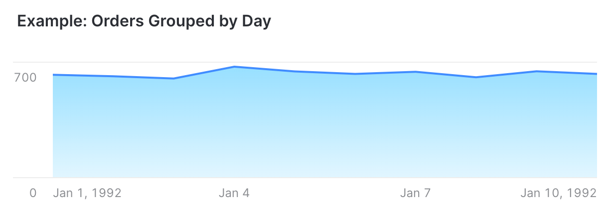
Hover over the chart to view details about each data point. For example, you can view your results as a line chart:
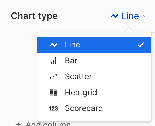
You can modify the type of chart used to display your query results.
- Select the chart type to choose a different type, for example, Bar.
You can manage the columns in your chart with the Data section:
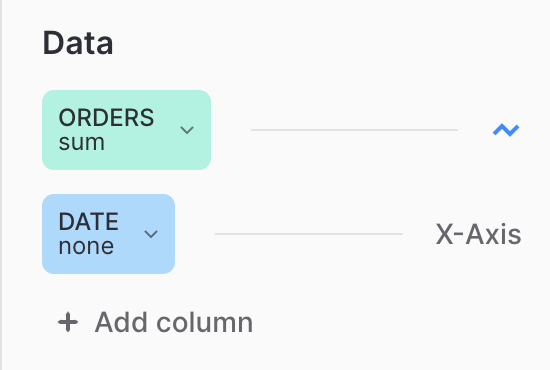
Select a column to modify the column attributes:
-
Add or remove columns.
-
Choose a different column in the query results to use in the chart.
-
Modify how column data is represented in the chart. For example, change the bucketing for a time column from day to minutes.
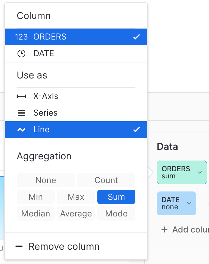
You can modify the column attributes to configure how data in that column is rendered in the chart. See Aggregate and bucket data for more details about managing aggregate data.
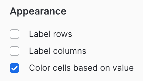
Style your chart in the Appearance section. The available settings depend on the type of chart. For example, for a heatgrid chart:
The exact content of your charts depends on your query results. To generate the examples in this topic, use the following query based on the Snowflake sample data:
Charts and new query results
Your chart updates automatically as long as the columns used by the chart are available in the query results. If a column name changes, you must update the chart to use the new column name. Charts indicate any columns that cannot be found.
Aggregate and bucket data
Charts simplify grouping numbers, dates, and timestamps of more or less continuous values into various buckets. For example, suppose your query retrieves per-day data over a period of time. Without modifying your query, you can easily select a different bucket of time (e.g. weekly or monthly data) in the inspector panel to change the time dimension of the results displayed in the chart.
Charts can bucket by date, week, month, and year for date columns. For numeric columns, charts can bucket by integer values.
Charts use aggregation functions to determine a single value from multiple data points in a bucket. These functions are as follows:
- average
- count
- minimum
- maximum
- median
- mode
- sum