Visualize data in Snowflake Notebooks
In Snowflake Notebooks, you can use your favorite Python visualization libraries, such as matplotlib and plotly, to develop your visualizations.
This topic shows how to visualize data in your notebooks using the following libraries:
The dataset
The examples in this topic use the following toy dataset that is based on the Palmer’s Penguin dataset.
| species | measurement | value |
|---|---|---|
| adeli | bill_length | 37.3 |
| adeli | flipper_length | 187.1 |
| adeli | bill_depth | 17.7 |
| chinstrap | bill_length | 46.6 |
| chinstrap | flipper_length | 191.7 |
| chinstrap | bill_depth | 17.6 |
| gentoo | bill_length | 45.5 |
| gentoo | flipper_length | 212.7 |
| gentoo | bill_depth | 14.2 |
You can create this dataset in your notebook with the following code:
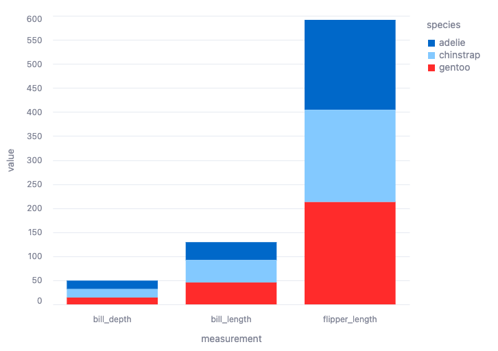
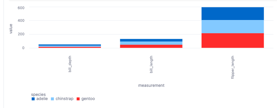
Visualize results with Altair
Altair is imported by default on Snowflake Notebooks as part of Streamlit. Snowflake Notebooks currently support Altair version 4.0. For details on available visualization types when using Altair, see Vega-Altair: Declarative Visualization in Python.
The following code plots a stacked bar chart of all the measurements in a dataframe named df that contains the toy dataset:
After you run the cell, the following visualization appears:
Visualize results with matplotlib
To use matplotlib, install the matplotlib library for your notebook:
- From the notebook, select Packages.
- Locate the matplotlib library and select the library to install it.
The following code plots the toy dataset, df, using matplotlib:
After you run the cell, the following visualization appears:
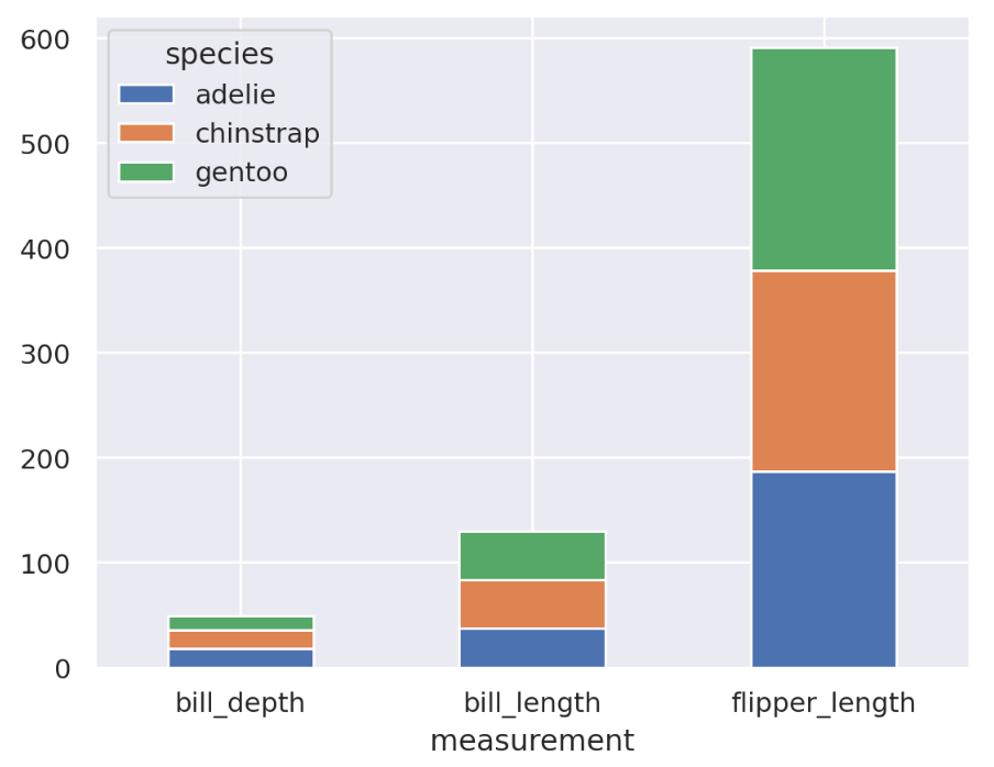
For more details on using the st.pyplot chart element, see
st.pyplot.
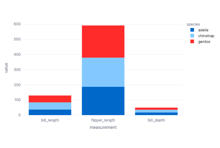
Visualize results with plotly
To use plotly, install the plotly library for your notebook:
- From the notebook, select Packages.
- Locate the plotly library and select the library to install it.
The following code plots a bar chart of the penguin measurements from the toy dataset, df:
After you run the cell, the following visualization appears:
Visualize results with seaborn
To use seaborn, you must install the seaborn library for your notebook:
- From the notebook, select Packages.
- Locate the seaborn library and select the library to install it.
The following code plots a bar chart of the penguin measurements from the toy dataset, df:
After you run the cells, the following visualization appears:
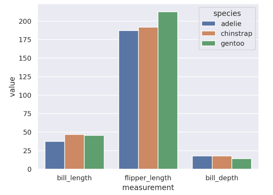
For more examples of seaborn visualizations, see the seaborn Example gallery.
Visualize results using Streamlit
Streamlit is imported by default in Snowflake Notebooks. You can use chart elements supported by Streamlit version 1.39.0 to create a line chart, bar chart, area chart, or a map with points on it. See Chart elements .
Note
Some Streamlit chart elements are not supported in Snowflake or might be subject to additional terms. See Streamlit support in notebooks.
To visualize the toy dataset, df, in a bar chart, you can use the following Python code:
After you run both cells, the following visualization appears:
To learn more about how you can build interactive data apps with Streamlit, see Streamlit in notebooks.